Planning blog: Title design
The opening credits of my film will appear in two different digital fonts that appear to be "typed" in the middle or right/left corners of the film.
Some credits will be embedded into the setting. For example, their may be credits written in places such as the front of the home, the kitchen, the loft and on kitchen tools such knives.
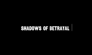
Working title: "Shadow of Betrayal"
The title will be in the font called "ITC Serif Gothic", all words will appear capitalized: SOMETHING ALONG THIS LINE.
My titles will be "typed" onto the screen onto the screen and will appear to be being typed while appearing on the screen. They will disappear of the screen using the fade out affect.
Each title will stay on the screen around 2-4 seconds each.
The fonts will range from the colors black, white, and red. The titles will will have the Gothic font while the names will have basic fonts. Looking something like this DIRECTED BY: Roselyn Rodriguez
The titles before each name will be 3 sizes smaller than the names.
Example: DIRECTED BY: Roselyn Rodriguez.


Comments
Post a Comment